Friday, 27 November 2009

Final Ancillary Tasks


Tuesday, 24 November 2009

dvd

Monday, 23 November 2009

Rough Final Idea

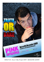
This image is of our rough final Magazine advert.
It includes all the essential information, such as release date, album name, artist name and the universal logo. We prefer this to our original advert as it illustrates the artist in the form he is seen in the feature video. Therefore it has a much stronger relationship between the image used in the advert and the images in the video. The colours used on the banner are also allot more successful than the colours used in the original as they are not so much of a strong blue therefore does not clash so much with the Pink which is used for the band name.

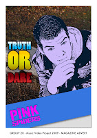
Initial Magazine Advert


This image is one of our initial designs for the magazine advertisement. We really liked the different effects that are used. We especially liked the cartoon affect that is used on the
artist. However it is not possible to link this effect to the band as they are no longer together, and their is also no link to the video. The strongest images in our video are those of the artist therefore it is essential that the artist is seen in the magazine advert and digipak without effects over him. This is to ensure a strong relationship between the ancillary products and the feature video. However there are parts of the image that we can and do intend to use in the final magazine advert. The banner that runs along the bottom of the advert we intend to keep, drawing the idea for this from the "Juliette Lewis" advertisement which we had previously looked at and is included on our blog. We like this as it helps to frame the artist. We also intend to include the same font from the original 'pink spiders' band, illustrated in pink and placed on the banner.

Friday, 20 November 2009

Plan for digipak and magaize ad

Digipak plan:
For our digipak we will use an image of the artist which we have already taken whist out on a photo shoot. The images consisted of the main artist within the forest location of which we filmed part of our music video. We will choose an image which shows the character of the artist that appeals to the genre of music. We plan to take the image and edit it in photoshop adding effects to enhance the image. The image will contain the artist name and album name, this being the pink spiders and truth or dare. We will use the original text from the pink spiders logo, within the digipak.

Magazine advert:
The magazine advert will also contain an image of the artist within the same location as this will keep to the same visual style. For the magazine advert we will also produce text to advertise the artist and the album, this again will be in photoshop. We have looked at examples of magazine adverts and will include relevant information such as release date, record label and where the album can be purchased. There will not be as much information on the magazine advert as there will be on the digipak.

Tuesday, 17 November 2009

Initial ideas for digpak and magazine advert

Our basic idea was to shoot different photos from different angles in an outdoor location. We took a selection of different images of the artist in different poses which we then intend to edit in photoshop. In this process we will be using different types of text and photo editing techniques. We will be experimenting with several of the more successful of our images to decide our final choices for the digipak and advert. We are planning on designing both using pictures of the artist as the main images.

Digipak/Magazine Advert Photo Analysis


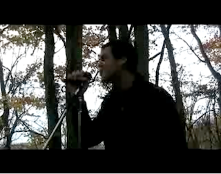
The image above shows the artist performing in a darker background. This image i believe would be successful for the digipak/magazine advertisement as it shows the artist live. This is important more in the case of the digipak as it gives the consumer a sneak preview of what is to follow in the didgipak.
The image also represents the artist as a confident person who is unafraid to get up and perform. The image also shows the artist getting very heavily in to the song, this is a good way to represent the artist as it automatically pulls the consumer in. A consumer will never want to see an artist who is withholding or shy (the reluctant star) they want to see some one that is exciting to watch.
The image however does not communicate the general mise en scene of the artist very well as the image is darker and it is not so easy to see the artists clothing. The fact that a microphone is used in this shot i believe is very important as it again enhances the artist as a great performer.
The colours of the image does not really link to the genre as the colours are darker which is not generally linked to the genre of soft rock. However i believe that the background used in the shot does draw on the soft rock genre as the background is of natural wildlife and therefore softens the dark colour scheme.
This image appeals to the audience as i have already mentioned the fact that it is an image of a live performance, and any fan of any artist/group wants to see them live. It also shows the artist from a side view so no direct gaze is used, however the notion of looking is used as we are watching the artist from a side view as if we were a friend watching the making of the video from the background.
This image i believe however would be more successful as the image on the back of a digipak as it is slightly darker and therefore would not portray the artist clearly enough on the front, whereas on the back it could portray all the necessary features without having to be the image that draws the consumers eye. 31

Monday, 16 November 2009

Digipak/Magazine Advert Photo Analysis


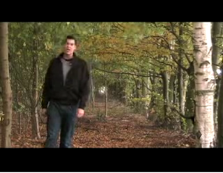
I chose this part of the video for the promotional products. It has an interesting background and shows a lot of the artist. Showing lots of the artist promotes the artist. I like that the artist is not in the center as it leaves space on the right side for the essential information. Also the artist being on the left means that the artist is the first thing to be noticed and seen by the eye. It also relates to the music video as it is the same location. However facial emotion and costume is the only thing that shows the artist's personality and the image could do with more as the artist is not doing anything, however generically it could work. It communicates the genre as it is a mixture between bright and happy pop and soft rock in the unusual location. This image appeals to the target audience as we are targeting a younger market and the viewer could possibly relate the costume to what they wear themselves.

Cover idea


Out of all the shots in our music video this is the one I would chose as the cover to a dvd/cd cover. This is because it clearly shows the artist singing with incredible emotion which if the potential customer saw they could see that they are getting an artists vocals and video who really goes for it. Not only this but it introduces the artist clearly to any potential buyer so they become familiar with them. As well as this the background shows what the DVD would include so they can get a feel for the finished product. Having the artist shown clearly yet only taking 1/4 of the image up then leaves a nice sized space to put the graphics of the text and logo of the band name.

Magazine advert idea


This is an image taken from our music video of the artist climbing over a fence outdoors. This could be used as the magazine advert as is shows the artist looking cheecky and like a rebel, therefore representing the artist as someone that does not always follow the rules. Therefore it would complement the song and give the artist a rebel image. This image shows the artist in everyday clothes, therefore showing the audeince that he seems a normal guy, however he is acting like a rebel. This links to the genre because it shows the artist being bad so therefore relates to the genre being a more rocky song. The image would appeal to the audience because it shows the artist which can be related to doing something he shouldn't be doing. The colours used within the picture are quite plain and simple so would need to be changed slightly to attracted the attention of the viewer.

DVD's And Digipak's For Music Video

Dvd's or digipaks are an important product to the artist and the way that they are represented. The essential information that is expected to be included on a dvd/digipak are:
Artists name
Album name
Image/Motif of artist
Rating
Track listing
These are nearly the same as the criteria on a magazine advert which makes you realize that the dvd case is doing as much of a job as advertising as the magazine. The product that follows with the dvd/digipak is the special edition version. These are used in the industry to increase the popularity of the artist. It is also used to increase revenue as consumers are more willing to pay that little extra for the chance to own a collectors item.
The dvd/digipak will include a variety of extra features that are not available anywhere else, this is the USP (unique selling point) for these items as they give the consumer a chance to go behind the scenes of the feature and to also enjoy a selection of interviews from the artist/artists. It also gives a chance to view live footage which is a must have for fans. Some artists also add their own personal note or autograph, this again allows the consumer to connect with the artist on a higher level.

Digipak Research


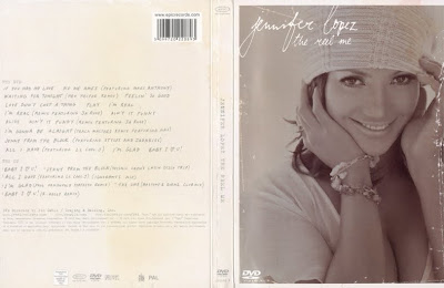
This digipak clearly shows a photo of the artist, the name of the artist and the name of the digipak album. It has a DVD logo to show it is a DVD. On the spine it has another dvd logo and record label logo along with the title artist name and title again. On the back it shows the listed tracks for the dvd and the listed tracks for the CD. At the bottom is has website information and Director's name. Finally it has the copyright information and further informative logos at the bottom.


This Digipak folds out to show images of the artist and has a pocket for a pull out booklet which contains photos of the artist and industrial institutional about the songs.

If you open the next pocket it reveals the DVD and CD. They are styled as reels of film which suggests it is a motion picture and relate to the title - "the reel me".


This is the outer protective case for the blur 'the best of' CD Digipak. The blur cd shows a cartoon version of each band member. It has the name of the album, the band name and what the CD contains. There is a bright colour scheme which attracts potential buyers to the cd. This is also a special edition cd with live tracks to add more value and attract more people to purchase the cd.


The back of the Case shows the track list and continues the colour theme. It also has institutional information.


The front of the inner cd continues with the theme with the blur logo printed on the case. It has the name of the album down the outer spine area.

The back again continues with the colour scheme but adds a few colours. It has the tracks again and institutional information. It also states that it was recorded in wembley live. This is an extra part that adds value to the digipak.

Magazine Advertisement's For Music Video's

The purpose of a magazine advert is to sell a set product. In order to do this it has to grab the consumers attention. A selection of methods is used to do this. Quotations taken from reviews from different sections of the press are generally used to show the positive opinions of others. These usually include music press, the general press and other successful artists. The other main device used for catching some one's eye is the image or images used. These range from the brightest most colourful designs representing artists such as Mika, to darker yet still bold images from Linkin park. Both are successful in their own way as the colours used have strong representations to the artists being advertised and both will attract attention from the different audience that it seeks.
A magazine advert will include different sections of information, although not all adverts use all necessary fields they generally take to mixing and matching. However the essentials that are included in most are as follows:
The name of the artist/artists
Name of the album
Date of release
Without these three essential fields the advert there may be some confusion to the consumer of what exactly is being advertised. Magazine adverts also tend to include information on the band or artists website, whether it be the official website or the bands social networking link.

Magazine Advert Research


This is the magazine advert for Juliette Lewis. We like this magazine advert because it is interesting and styled towards a younger audience from the Juliette Lewis text and modern info banner. The magazine advert includes the tour dates, release date, website, myspace, record label website, artist name and album name. It shows it can be purchased from play.com and shows the price. It also shows who has produced some of the songs on the CD. It shows a image of the artist, the same one as the album cover, and has a few added effects to enhance the image.

Friday, 13 November 2009

Final Video


This is our final video including all of the extra footage and video filters.

Wednesday, 11 November 2009

Second Rough Cut


This is our second rough cut including the new footage. We do not plan to add any new footage between now and our final submission, however we do plan to change the existing footage slightly and to maybe add some effects or filters.

Tuesday, 10 November 2009

Production meeting and filming


After having another production meeting we decided there was no main performance that the rest of our video was based around. We realized very quickly without this main performance we were in trouble. Also the performance we do have was not dynamic enough and did not sell the artist well enough. We needed to get more close ups of the artist and we needed a main performance with a couple of different angles on the same location.
Taking notice of these points we went out and got four or five strong performance scenes. We will be aiming to use this as the background for the rest of our piece and will cut between these five at regular points to stop the video looking sluggish and to keep the videos pace up.
We tried to use a couple of different shot types to illustrate the artist, we used a high shot which proved to be more difficult than first thought as our artist is 6ft 9" so we had to film down while he was kneeling to fit it in. However this did work quite well as we managed to cut the bottom part of the artists body out of the shot meaning you cannot tell that he was kneeling. It did however limit the angle of the shot we could use.
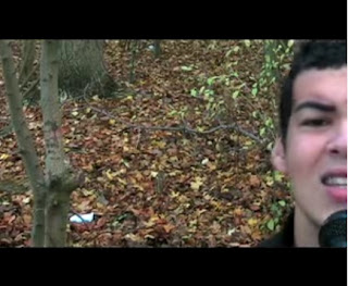
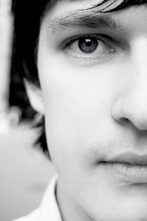
We also used a shot using half of the artists face but at a close up, the image illustrates this camera angle, however we are using colour in our video and not just black and white.

Monday, 9 November 2009

Filling the gaps

After submitting our rough cut we went out to do some more filming to fill the gaps. We tried to show different camera angles and different types of shots. We recieved feedback from other groups noting the lack of close ups. This is an important point in a music video as it advertises the artist. Following this point we decided to film one of the performance locations using a close up shot. We located the shot under a bush, this is to enhance the narrative of the artist following/watching the girl in the video. We also filmed some more footage that we plan to cut to the beat, we have used a couple of these types of footage already in our video but it keeps the video interesting and also picks up the pace. Another shot we used was a low angle shot, showing the feet of the artist and female walking toward and away from the camera, again this is aimed at enhancing the narrative.

Tuesday, 3 November 2009

Response to Feedback

We have looked at our feedback and addressed what we need to improve and re-do.
We are going to re-film the scene in the "coffee shop" as the tired face look looked too boring and monotonous. We are going to try and use more shot types and enhance the costume. We are going to film more close up performance shots as people think it lacked enough. We are going to try and get Ed (the artist) to show more emotion to keep the viewer interested. We are going to record more to fill the gaps and more to enhance the quality and keep the viewer interested. We may use some effects (possibly filters) in the editing process to make the locations look better as this was brought up in the feedback.

peer feedback-Artist representation

Artist representation

There are a few well used close-ups of the artist singing which shows the artist representation by having the artist sing and by doing this it fulfills the record labels needs by showing off the artist si the audience like him. the audience are also made to think the artist is fun as he does a funny dance which makes the artist likable.

It also includes direct gaze and performance, as well as narrative.
Although sometimes the artist could be giving more expression whilst performing (singing).

Teacher Rough Cut Feedback

There are some very technically proficient aspects to this video such as the motion and the jumpy movement of the characters to the beat of the music, these sections make the video more dynamic. However there are also some sections that are not dynamic at all. The song has a lot of energy to it and what your video lacks on occasion is energy. You need more close-ups of the artist and the narrative to add diversity to the video.
The selection of mise-en-scene could be stronger in places - what you need to do is think about how you make it look less like students making a video and more like a professional artist starring in their music video. Take a look at this video from last year and think about what makes it look very professional and think about how you could use it as a basis to improve your own video further.

You have worked hard so far - now you need to think abuot how you can use the opportunities you have for more filming to further enhance your video. Also remember to incorporate the capturing of still images for your ancillary tasks in your planning.

Peer Feedback

There was a lot of use of lip-syncing that really added to the overall story. But there were sections where I'm sure the group know were missing but so far i think that the story has been put forward very professionally.

Peer Feedback

S1-23 - Overall the story gos really well with the theme, the opening works well as it has different shots of the car driving. The ending is also very strong as it brings the story to a close in a well thought out frame. Filters are needed to make it seem more attractive rather than 'cold england'.

Music and visuals - The fighting fits the song but may seem a bit over used. The fast shots fit well, particularly on the bench and the lip syncing is good. The shots run well into each other and is quirky.

Peer Feedback

Shaun, Ruth, Gerald and Emily - Group 19

Genre characteristics:
Stayed within the genre of pop-rock well. The shots e.g. the sugar going into the cup, the sense of them pushing to shot to the next one and the stills on the bench were quite fun and added a positive pop-rock element.

Monday, 2 November 2009

Rough Cut

 
© 2009 GROUP 20 - Music Video 2009/10. All Rights Reserved | Powered by Blogger
Design by psdvibe | Bloggerized By LawnyDesignz