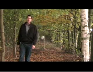
I chose this part of the video for the promotional products. It has an interesting background and shows a lot of the artist. Showing lots of the artist promotes the artist. I like that the artist is not in the center as it leaves space on the right side for the essential information. Also the artist being on the left means that the artist is the first thing to be noticed and seen by the eye. It also relates to the music video as it is the same location. However facial emotion and costume is the only thing that shows the artist's personality and the image could do with more as the artist is not doing anything, however generically it could work. It communicates the genre as it is a mixture between bright and happy pop and soft rock in the unusual location. This image appeals to the target audience as we are targeting a younger market and the viewer could possibly relate the costume to what they wear themselves.
No response to “Digipak/Magazine Advert Photo Analysis”
Leave a reply