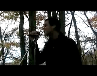
The image above shows the artist performing in a darker background. This image i believe would be successful for the digipak/magazine advertisement as it shows the artist live. This is important more in the case of the digipak as it gives the consumer a sneak preview of what is to follow in the didgipak.
The image also represents the artist as a confident person who is unafraid to get up and perform. The image also shows the artist getting very heavily in to the song, this is a good way to represent the artist as it automatically pulls the consumer in. A consumer will never want to see an artist who is withholding or shy (the reluctant star) they want to see some one that is exciting to watch.
The image however does not communicate the general mise en scene of the artist very well as the image is darker and it is not so easy to see the artists clothing. The fact that a microphone is used in this shot i believe is very important as it again enhances the artist as a great performer.
The colours of the image does not really link to the genre as the colours are darker which is not generally linked to the genre of soft rock. However i believe that the background used in the shot does draw on the soft rock genre as the background is of natural wildlife and therefore softens the dark colour scheme.
This image appeals to the audience as i have already mentioned the fact that it is an image of a live performance, and any fan of any artist/group wants to see them live. It also shows the artist from a side view so no direct gaze is used, however the notion of looking is used as we are watching the artist from a side view as if we were a friend watching the making of the video from the background.
This image i believe however would be more successful as the image on the back of a digipak as it is slightly darker and therefore would not portray the artist clearly enough on the front, whereas on the back it could portray all the necessary features without having to be the image that draws the consumers eye. 31
No response to “Digipak/Magazine Advert Photo Analysis”
Leave a reply