Josh Grief - Media Evaluation
Media Evaluation
1. In what ways does your media product use, develop or challenge forms and conventions of real media products?
Our Music Video has been made using the forms and conventions of the Indie rock genre and applied them to our video. Indie rock videos are generally based around the idea of showing the artist or band performing. As well as this the speed of the cuts will generally be faster than a pop video because of the tempo of the song. Narrative is often used to compliment the video. This is the route we went down by using a main location and performance of the artist to cut back to, we where able to use these conventions while developing it by having the artist in a narrative scenario whilst still performing.
We used a colourful wood and outdoor location to avoid a dark looking video. This is because of the song being upbeat so the colours of locations suit the feel of the song. To help this even more so we used filters to increase the saturation on many of the clips not only to make the colours seem a continuous flow but to make it a visually more colourful.
The video also develops on the conventions of other indie rock videos for instance the shot of the artist in the car to keep the shot types fresh and interest the viewer. Again we developed on the shot types we used like other video’s we have researched, like the shot looking up at the artist in the forest.
In our attempt to challenge indie rock video conventions as well as other genre music videos in general we used stills. This creates a different look that stands out to the viewer which mixes in nicely to vary what the viewer sees.
2. How effective is the combination of your main product and ancillary texts?
There is a clear link between all of our products; the basis of this is the location in this which is the same the main bulk of out music video in the forest where the artist is seen by himself singing. By using the same location and having the artist by himself without a band for example clearly shows they are representing the same thing. The ancillary texts specifically are linked well together by being made up using similar parts these being – The pink spiders logo, bright colours, bold text as well as the same institutional information.
Not only do they link well together but also link reasonably well to the genre of indie rock by showing the artist as the main focus as well as using more unusual backgrounds. To keep the link strong between all 3 pieces we did not put an effect on the artist as there was none used in the video and by putting one on in the ancillary texts we could have visually separated the products.
By keeping the main artist as the focus for each product there is a continuous theme throughout. This creates a brand identity so the products can be easily recognized as a group of products on the same thing. While having this strong link they also represent the artists personality by showing different facial expressions and posture. This would then appeal more to the target audience as it shows his fun and laid back attitude to life.
3. What have you learnt from your audience feedback?
3. What have you learnt from your audience feedback?
The first feedback we got was from our pitch. From this we could see that we had a strong basic idea but we needed more detail. This then helped us because we realized we had to put more focus on location and shot types. Not only this but the digipack at the time of the pitch lacked attention. Because of these things we then had a stronger base model to our project to work from.
From looking at the feedback we received on our blog as well as verbal feedback we could see where our products where failing and what needed rectifying and the positive feedback showed us we where heading in the right direction with the visuals of the products.
After getting feedback from people viewing the rough-cut we where able to see that our video was no dynamic enough, by getting this information early on we were able to go out and re-shoot parts of the video to get more close up shots of the artist. We then used this to cut back to which enabled us to achieve faster cuts which goes with the tempo of the song which we couldn’t have achieved without the feedback as we lacked the footage or the varying shot types to change to. This then made our final video keep the inertest of the viewer far better than the first attempt. Other feedback form the peer group "Filters are needed to make it seem more attractive rather than 'cold england'." By using this information we took the criticism and did as it said. By adding these filters we created a brighter more colourful video. So this feedback helped develop our video further.
On the ancillary feedback side early on we where hearing that it wasn’t unique enough and very plain. We remedied this by changing the background effect and made the text simpler so the photograph text and effects linked well together.
4. How did you use new media technologies in the construction and research, planning and evaluation stages?
By using the internet we were able to quickly and effectively gather information on the forms and conventions of other indie rock videos, as well as other genre’s of videos to learn about how they are constructive and the different techniques that can be employed to create a professional video. We were also able to look through images on the internet to create a mood board which meant we could create the visual theme of the video into one board that gave us a a strong thing to aim for.
After coming up with an idea with the use of the internet we were able to make our story board on final cut which gave us a feel for what our final video would look like. From there we were able to use our footage to put together the video. It enabled us to cut the footage up and easily place it where we wanted to get the lip syncing correct. We could also use it to change filters which made the video in the forest all look the same which it did not when it came off the camera because of the changing light conditions.
Photoshop let us make unique ancillary pieces bye adding effects to the background and we could also use this alongside the internet to put institutional information on our products.
Without the use of the internet we would not have been able to create such a strong video that links to other music videos of this genre as well. This therefor means we could create a music video to the expectations of the audience.


Evaluation
1. In what ways does your media product use, develop or challenge forms and conventions of real media products?
Our media product consists of a music video and ancillary tasks, these being a magazine ad and digipak cover. When planning the construction of the music video we had to keep the genre of pop in mind. We discussed how we would engage with the conventions of a pop music video. Whilst discussing this we decided that the main focus was selling the artist as a pop artist. Therefore we decided it was extremely important to focus on solely the main artist alone, we did not want to include performance from the band as we thought this was unnecessary. We gathered our thoughts and researched into other music videos of this genre and found that to sell the artist effectively we would need to show many close ups and mid shots showing off the artist.When planning the music video we had to consider particular conventions; one of these being performance from the artist. We mainly had the main artist performing throughout; we also had shots of the artist doing other things, one of these being driving. Another was relating music to visuals, this is typical in music video as the editing is done to complement the music and also change locations. Within our music video we had the artist moving up and down a bench and edited the footage to the beat of the music. Finally we related lyrics to visuals which is typical of a music video, we did this to illustrate the lyrics through footage of the artist, an example of this in the video is when one of the lines states every argument is endless, we then showed the artist and a female arguing.The music video is typical of a pop/rock video in showing a narrative based on two characters, this being the main artist and a female. There is also a main performance from the artist throughout the video. The props used within the music video are typical of this genre, with one of these being a car representing current teenage life.Another consideration we thought about was the locations used within the music video, one of these being a cafe when the generation being represented would be seen. We also added filters to the video which made locations seem brighter giving a colourful atmosphere relating to the genre of pop.The music video develops conventions as within this there are typical pop moments for example singing in the car, however involving an element of comedy. Our music video has been influenced by real media products, one of these being a video by Franz Ferdinand as we use similar techniques when cutting from one shot to the next.When constructing the ancillary tasks we followed conventions for the pop genre. This is because we had the artist surrounded by bright colours and text. This is an artistic way of representing the upbeat genre of music and conveying the mood of the music to the audience. The magazine ad showed the artist surrounded by a bright blue colour and the digipak showed the artist again surrounded by bright colours.
2. How effective is the combination of your main product and ancillary tasks?
All three products share a particular visual theme which binds them together to create a promotional package. All three of the products share the same brand identity and are easily recognisable as group products. All three show the artist in a simple way, this being just the image of the artist, this therefore presents the artist clearly and shows that the products are related to the pink spiders.The artist is represented in all three products in the same way, this being a typical guy who would be liked by many people, therefore this is a single identity as there are not two sides to the artist. This is typical of a pop/rock video as artists are represented as a nice person who would be a role model therefore providing someone to look up to. This would appeal to the target audience of teenagers as the artist is represented as a friendly character and the audience would want to be like him.The combination of both the music video and ancillary tasks is very effective this is because they both represent a similar visual style. All three of the products show a consistent theme and are recognised by the Pink Spiders logo. Both the products focus on the main artist throughout using close ups and mid shots in the music video the artist is shown performing using direct gaze, but also in the magazine ad the artist also uses direct gaze.The ancillary tasks consist of a photo of the artist surrounded by a glow and bright colours with bold text representing the pop genre. When creating the ancillary tasks we used no visual effects on the main artist to tie in with the music video as this was the main focal point. Therefore the theme of all three products was consistent. The artist was also shot images of in a similar location to the music video, this being the forest, this therefore showed the same theme and did not contradict the music video and the locations used.The combination of all the products works well together and would be a success in promoting and selling the artist this is because the artist can be clearly recognised and there is a consistent theme without and bright bold colours are used to represent the genre of pop/rock.
3. What have you learnt from your audience feedback?
The feedback we received was from impartial sources and was presented on our music video blog, this was available online and gave anyone the chance to add comments about our video, and therefore this widened the range of feedback we received. The feedback from our pitch stated that we needed to consider the magazine ad and digipak cover as well as the music video. From the pitch it was found that the editing techniques we proposed were strong ideas. This helped us as we then were able to think about how all three products would work together to give a collective identity. Therefore once we had constructed the music video we could see what would work well to represent the artist for the digipak cover and the magazine ad.We were able to use the class as a sample group of our target audience; this enabled us to get feedback from many groups within the class as to what they thought about the music video. The feedback given from the audience regarding the rough cut for the music video is generally positive. The audience were able to identify the genre and thought that the shots and stills used added a positive element.The feedback told us that parts of the music video were dynamic; however other parts were not dynamic at all. Therefore from this we were able to re shoot the music video, again covering the whole song so that we could use sections from the new footage to replace the old footage; therefore we had performance from the main artist. The feedback was very helpful because we learnt that to make a good music video we needed to make the product dynamic, using many shot types and effects to keep the attention of the audience. We learnt that also when making a music video always have the genre in mind so that we could stick to the conventions of a pop video.The feedback we received from the draft magazine ad showed us that there was not a strong enough visual relationship between it and the music video. This was because the magazine ad contained visual effects on the artist’s face and therefore it was difficult to identify the artist without having the pink spider’s logo also. Therefore we decided to not use effects on the artist’s face but on just the background of the image instead. This helped as the audience would be able to relate to all three products and could identify the artist from the image not including the logo. The feedback also received regarding the ancillary tasks also told us that the text used did not look professional as it contained multiple colours and was in an inappropriate font. Therefore from this we changed the font and colour, this being a black to make the product more professional and take the emphasis off just the text.Without the feedback from the various sources our products would look very different and would not be as effective, this therefore was a valuable part of the production of the music video and the ancillary tasks as it enable us to learn what appealed to the audience.
4. How did you use new media technologies in the construction, research, planning and evaluation stages?
We were able to use new media technologies in order to assist us. One of these was by using the internet. Without the internet we would have found it extremely difficult to produce the music video and ancillary tasks. This is because without the internet we would have not been able to view music videos of the same genre. This would have put us at a disadvantage because we would have not fully understood what is needed in a music video to follow conventions and appeal to the audience.We were able to use YouTube to view music videos of our genre, so we could see things to include in the video. One of these being Break your heart by Taio Cruz. We watched the video and saw that bright bold colours were used to represent the genre of pop; there were also notions of looking included where the artist gave direct gaze which we used within our music video. This also enabled us to come up with ideas as to how to make our music video. We also used the internet to present our ideas; this was presented on our blog. We used this to note down any research we carried out into pop/rock videos and also it used to show initial ideas for each individual product along with detailed plans as to how we were going to carry it out. The blog was also used as a log which we updated regularly telling people how we were getting on in the production phases an example being the filming log which we wrote after we had been out on location filming and reflected back on how it went. The feedback received from peers was helped as we could see the audience’s thoughts and opinions as to what worked well and what needed work in our music video.We were able to use final cut also to create and enhance our music video. The first time we used final cut was to create our storyboard, this enabled us to see clearly our ideas and could use it as a reminder as to what we wanted to achieve. We also used final cut to edit test footage, we had the artist move up and down the stairs so we were able to practice cutting to the beat, this would provide us with the knowledge and correct technique for the music video. Final cut also helped as we were able to add filters, therefore enhancing the video relating it to the genre.Photoshop helped us when creating our ancillary tasks; this was because we were able to add many items to our products easily. We were able to add colour this meant that we could use the same effects on both the digipak cover and magazine ad to give a visual style which tied all the products together. The institutional information added was to make the product seem realistic and was typical of these type of products in informing the public of the single and the artist, this would help when promoting the artist to the target audience.
Wednesday, 9 December 2009
Feedback to Connor on Evaluation
Your responses are very good, put the question numbers by your responses to make it clear which answer is to which question. Talk about the choices you made about your engagement with the conventions of music videos from your genre of music. Also talk about how you engaged with the form of music videos, obviously it's very different from the narrative video forms you have worked on before. Also talk in detail about specific conventions you used and give examples from your texts. Talk about the video, the magazine ad and the digipak. Discuss the conventions of the ancillary products and which ones you used and/or challenged.
Question 2 talk about the representation of the artist in all three products, do they work in combination to communicate something specific about the artist.
For the question on new media technology talk about some more specific examples of using the internet for looking at examples of other videos from that genre, research into target audience etc.
Also the question about feedback, mention all of the points at which you got feedback, pitch, rough cut, final cut, digipak and magazine ad draft and final versions etc. Also talk about peer feedback and using the class as a sample group of your target audience.
Give specific examples of feedback you received (use quotes or screengrabs if you wish), state what you learnt from the feedback and how you responded to it.
You MUST make these improvements to your evaluation.
Tuesday, 8 December 2009
Evaluation draft
In what ways does your media product use, develop or challenge forms and conventions of real media products?
1. Our music video uses a blend of traditional conventions of a pop/indie rock music video to create a colourful vibrant atmosphere. The feature video is heavily performance based this is expected of this particular genre of music. We have also chosen to include a narrative that runs throughout the whole video. This is used to keep up the fast pace of the video, from transition to transition, and to also give the audience something else to follow. We chose to stick with many of the main conventions of our specific genre of music, sticking with a vibrant location and even mix of narrative and performance. We also included one main performance location to repeatedly link back to throughout the video giving the video a much better sense of cohesion. The locations used depict an upbeat colourful atmosphere, this links back to the genre of pop. However we also used some video filters on certain pieces of footage to take the colour from the shots, this represents the jump from past to present, and also shows the darkened mood of the two characters. This counteracts the pop genre however one would argue it fits in perfectly with the sub genre of rock. Whilst producing the music video we took the time to develop the conventions for our specific genre, an example of this would be the singing in the car. Adding shots like this also helped us to add elements of comedy to the video which is never a bad thing when done correctly and in the right taste. We challenged the conventions of general music video's in different ways, one being adding stills to our video. When watched closely allot of our shots are actually stills, the occasions on which they are used are opportunities to cut to the beat. We really liked the idea of the characters moving up and down a park bench, we used a collection of different 5 second clips to put together and cut away to create a sequence of jumps, we then timed the shots correctly to create the cut to the beat. Our music video tends to stick to the very colourful pop/indie rock conventions. It uses the combination of brightly lighted locations and a fast frame rate to keep with a upbeat atmosphere. This music video was much different than anything we had looked at before not due to the generic characteristics. But the actual song was much more underground so a mainstream video would not of suited it and we tried to play on the fact that the song could of been classed as an indie rock video. This gave us a whole new set of conventions to play with. You can see these in the form of darker filters hence the black and white argument and the darker performance shots. Throughout most of our music video you can see the clear visual relationship between the music and videos one of theses is when the artist sings; "That i need to stay awake," he is drinking a cup of coffee in a cafe. these relationships are necessary in keeping with Goodwins characteristics of a music video. The ancillary products tended to stick with the generic conventions of the genre as they included bright colours and a main picture of the artist on both the magazine advert and digipak as a focal point. They also included necessary institutional information and the 'Pink Spiders' band logo.
How effective is the combination of your main product and ancilliary texts?
2. The combination of our main task and ancillary tasks i believe works well, there is a very obvious visual relationship between the two ancillary tasks, this being the affect that is used on the background. We chose this particular affect as it brought out the very strong colours of the trees in the background. However if the image was just left naturally this could of also been done but not to the same affect, because as well as bringing through the colours from the tree's it also darkens everything else around them. We have left the artists face unaffected in both ancillary tasks, this is to create the link back to the feature video. We chose the image of the artist to connect with the video, as he is heavily illustrated in the video and is the main focal point. In doing this we ensure that our products sell as a group and are easily recognisable as a particular brand name (The Pink Spiders). The artist is represented as a confident singer and exciting performer. At first the footage we had was boring and very static, however after we discovered this problem we went out and filmed allot more performance based footage, except this time the artist looked allot more convincing and performed for the camera more. With this new improved footage including some more close ups we managed to include many more examples of the notion of looking and direct gaze. The three tasks also share a consistent theme; this includes Institutional information, bold text, and the original Pink Spiders logo. We created our graphics to relate to our genre of pop/indie rock, we used photo shop to mould and shape the affects into the most colourful and vibrant that we could achieve. The collection of all three products are effective and i believe could be used to launch a successful campaign for the artist.
What have you learnt from your audience feedback?
3. We have continually received feedback from different resources on our products and have tried very hard to take everything said on board. We also used this feedback to edit our products in the most efficient way. Most of the feedback we have received is verbal feedback from impartial sources. However our blogs are also available for anyone to view and comment on at any time. We received a comment from one source informing us that the pink spiders where no longer a band and therefore we needed to seek permission to use there song from Matt Friction who owns all publishing rights, unfortunately after following this up and trying to find the facebook page that we were given to contact him on we discovered that it was not possible to message him. We also received some feedback from our particular media class, basing them as the audience. From this we discovered that some of our shots where very static and therefore not synthetically pleasing, after receiving this feedback however we made an obvious decision to scrap allot of the footage that we had started with and to go back and film more interesting performance based shots. Thanks to all the different types of feedback we received we discovered the key to creating a truly great music video is diversity, the video must use a huge range of different shot types, locations, props, and affects. The footage used also needs to be diverse and quick to change to keep the audience interested and engaged. The feedback given from the audience regarding the music video however was generally positive, they were able to quickly identify the genre and noted that the range of shots and stills added a positive element.
How did you use new media technologies in the construction and research, planning and evaluation stages?
4. The media technology available made it possible to create our video, however without one of the many programs that we used to research, create, film and edit our music video with this project would not of been possible. We used the Internet to research our products, finding different designs for our ancillary tasks on the web helped us to design our own. Without YouTube we would not of been able to research other videos in the same genre, this would mean we would be working blind and i am sure our final product would have been no where near as successful. In the construction stages we used programs such as 'Final Cut Express' and 'Photo Shop' to make our products look proffesioanl. We also used final cut to create a storyboard, this is very important to the whole project as it allowed us to see our plan of our video in video, not just written up in words on the blog. We used the website www.blogger.com to record all our planning and research for our main video and two ancillary tasks, this was another important program in the success of our project. Final Cut Express allowed us to edit our test footage which again helped the construction of the feature video as it meant that we did not make any foolish errors when filming for the real thing. However final cut helped us to construct a successful music video by allowing us to add filters on to our existing footage, and to also cut and change the clips we had with great ease. This added diversity to our video, and a good pace of transisions, it also allowed us to cut to the beat. When creating our ancillary tasks we used a mix of photoshop to construct the actual tasks and the internet to research and find institutional information. Photoshop greatly enhanced the possibilities available to us when creating the two ancillary tasks as it gave the options of different texts, affects, and colour schemes.
Tuesday, 1 December 2009
Video Commentary Plan
We are going to include the whole group in the commentary talking about different parts of the video with different opinions.
The main points we are going to include are split up into the main questions, before each we will have a title introducing the points we are going to show.
Q1 - In what ways does your media product use, develop or challenge forms and conventions of real media products?
- Our music video uses generic conventions on music videos and genres along with original and unusual ideas to make it unique and interesting.
- Heavily performance based which also follows a narrative which is typical of this genre.
- The props used within the music video is typical of this genre with one being a car representing the current teenage life.
- The locations used help to depict an upbeat colourful atmosphere, this links back to the genre of pop. however we also used video filters and effects to take the colour out of some shots, this was done to illustrate the jump in time from present to past.
- These filters seem to counteract the typical conventions of a pop video, however you could argue that these darker shots fit in nicely with a rock video.
- The music video also develops conventions as within this there are typical pop moments for example singing in the car, however involving an element of comedy.
- We tried to challenge the conventions of music videos in general for example, we included stills within the video, which is uncommon in most music videos. We were also trying to stick to the generic conventions of music videos making the mix more difficult, however we managed to achieve it.
This section will be accompanied with clips from the video with voiceover also blended with an interview style video of the group members.
Q2 - How effective is the combination of your main product and ancilliary texts?
- The combination of the main products and the and the ancillary tasks are very effective and show a strong visual relationship as they represent a similar visual style.
- All 3 are easily recognisable as group products as they all share a consistent theme, this being bright colours, bold text and institutional information along with the pink spiders logo.
- We constucted our graphics to relate to the pop/indie rock genre and apeal to the target audience, we used bright colours and modern effects to achieve this.
- When creating the ancillary tasks, this being the magazine advert and digipak, we used no visual effects on the main artist to tie in with the music video as this was the main focal point.
-
- The combination of the products are very effective as together, they could launch a successful music video in an effective way.
This section would be shown by interview style clips blended with stills of the ancillary texts and the software used to achieve this.
Q3 - What have you learnt from your audience feedback?
-The feedback we recieved was verbal feedback from impartial sources, we also had our blog available for anyone to comment on online, this gave us wider sources of feedback. We also had feedback recieved from test viewers in our class.
- The feedback given from the audience regarding the music video is generally positive. The audience were able to identify the genre and thought that the shots and stills used added a positive element.
- From the feedback we found that parts of video were dynamic, however other parts were lacking this, and were able to re-shoot certain scenes after the roughcut. This was mainly focused around extra performance of the artist.
- The feedback was extremely helpful because we learned that to make a good music video we needed diversity, using many shot types and effects to keep the attention of the audience.
This section would be shown by interview style clips blended with captured clips or stills of the blog and other feedback methods.
Q4 - How did you use new media technologies in the construction and research, planning and evaluation stages?
- Without new media technologies, the project would have been extremely different. Even in the beginning stages we were using new media (the internet) to research music videos, watch them online and decide on how to carry out the whole project.
-In the construction stages we used specialist software such as Photoshop and Final Cut, these dramatically simplified the way we went about producing professional products.
- We were first using final cut to create a storyboard which was important because we could clearly see our ideas and use it as a reminder as to what we wanted to achieve.
- We also used final cut to edit the test footage, this helped us to learn and perfect techniques that we needed in the final video.
- The main way it helped was for constructing the final video, we were able to add filters and cut the footage therefore enhancing the video and relating it to a pop genre.
- The internet also helped us find institutional information and logos which were helpful to promoting the artist.
This section would be shown by interview style clips blended with captured clips or stills of the group developing the products and stills of the software.


Monday, 23 November 2009
Rough Final Idea
This image is of our rough final Magazine advert.
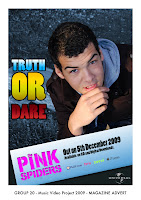 It includes all the essential information, such as release date, album name, artist name and the universal logo. We prefer this to our original advert as it illustrates the artist in the form he is seen in the feature video. Therefore it has a much stronger relationship between the image used in the advert and the images in the video. The colours used on the banner are also allot more successful than the colours used in the original as they are not so much of a strong blue therefore does not clash so much with the Pink which is used for the band name.
 Initial Magazine Advert
This image is one of our initial designs for the magazine advertisement. We really liked the different effects that are used. We especially liked the cartoon affect that is used on the
 artist. However it is not possible to link this effect to the band as they are no longer together, and their is also no link to the video. The strongest images in our video are those of the artist therefore it is essential that the artist is seen in the magazine advert and digipak without effects over him. This is to ensure a strong relationship between the ancillary products and the feature video. However there are parts of the image that we can and do intend to use in the final magazine advert. The banner that runs along the bottom of the advert we intend to keep, drawing the idea for this from the "Juliette Lewis" advertisement which we had previously looked at and is included on our blog. We like this as it helps to frame the artist. We also intend to include the same font from the original 'pink spiders' band, illustrated in pink and placed on the banner.
Friday, 20 November 2009
Plan for digipak and magaize ad
Digipak plan:
For our digipak we will use an image of the artist which we have already taken whist out on a photo shoot. The images consisted of the main artist within the forest location of which we filmed part of our music video. We will choose an image which shows the character of the artist that appeals to the genre of music. We plan to take the image and edit it in photoshop adding effects to enhance the image. The image will contain the artist name and album name, this being the pink spiders and truth or dare. We will use the original text from the pink spiders logo, within the digipak.
Magazine advert:
The magazine advert will also contain an image of the artist within the same location as this will keep to the same visual style. For the magazine advert we will also produce text to advertise the artist and the album, this again will be in photoshop. We have looked at examples of magazine adverts and will include relevant information such as release date, record label and where the album can be purchased. There will not be as much information on the magazine advert as there will be on the digipak.
Tuesday, 17 November 2009
Initial ideas for digpak and magazine advert
Our basic idea was to shoot different photos from different angles in an outdoor location. We took a selection of different images of the artist in different poses which we then intend to edit in photoshop. In this process we will be using different types of text and photo editing techniques. We will be experimenting with several of the more successful of our images to decide our final choices for the digipak and advert. We are planning on designing both using pictures of the artist as the main images.
Digipak/Magazine Advert Photo Analysis

The image above shows the artist performing in a darker background. This image i believe would be successful for the digipak/magazine advertisement as it shows the artist live. This is important more in the case of the digipak as it gives the consumer a sneak preview of what is to follow in the didgipak.
The image also represents the artist as a confident person who is unafraid to get up and perform. The image also shows the artist getting very heavily in to the song, this is a good way to represent the artist as it automatically pulls the consumer in. A consumer will never want to see an artist who is withholding or shy (the reluctant star) they want to see some one that is exciting to watch.
The image however does not communicate the general mise en scene of the artist very well as the image is darker and it is not so easy to see the artists clothing. The fact that a microphone is used in this shot i believe is very important as it again enhances the artist as a great performer.
The colours of the image does not really link to the genre as the colours are darker which is not generally linked to the genre of soft rock. However i believe that the background used in the shot does draw on the soft rock genre as the background is of natural wildlife and therefore softens the dark colour scheme.
This image appeals to the audience as i have already mentioned the fact that it is an image of a live performance, and any fan of any artist/group wants to see them live. It also shows the artist from a side view so no direct gaze is used, however the notion of looking is used as we are watching the artist from a side view as if we were a friend watching the making of the video from the background.
This image i believe however would be more successful as the image on the back of a digipak as it is slightly darker and therefore would not portray the artist clearly enough on the front, whereas on the back it could portray all the necessary features without having to be the image that draws the consumers eye. 31
Monday, 16 November 2009
Digipak/Magazine Advert Photo Analysis

I chose this part of the video for the promotional products. It has an interesting background and shows a lot of the artist. Showing lots of the artist promotes the artist. I like that the artist is not in the center as it leaves space on the right side for the essential information. Also the artist being on the left means that the artist is the first thing to be noticed and seen by the eye. It also relates to the music video as it is the same location. However facial emotion and costume is the only thing that shows the artist's personality and the image could do with more as the artist is not doing anything, however generically it could work. It communicates the genre as it is a mixture between bright and happy pop and soft rock in the unusual location. This image appeals to the target audience as we are targeting a younger market and the viewer could possibly relate the costume to what they wear themselves.
Cover idea
 Out of all the shots in our music video this is the one I would chose as the cover to a dvd/cd cover. This is because it clearly shows the artist singing with incredible emotion which if the potential customer saw they could see that they are getting an artists vocals and video who really goes for it. Not only this but it introduces the artist clearly to any potential buyer so they become familiar with them. As well as this the background shows what the DVD would include so they can get a feel for the finished product. Having the artist shown clearly yet only taking 1/4 of the image up then leaves a nice sized space to put the graphics of the text and logo of the band name.
Magazine advert idea

This is an image taken from our music video of the artist climbing over a fence outdoors. This could be used as the magazine advert as is shows the artist looking cheecky and like a rebel, therefore representing the artist as someone that does not always follow the rules. Therefore it would complement the song and give the artist a rebel image. This image shows the artist in everyday clothes, therefore showing the audeince that he seems a normal guy, however he is acting like a rebel. This links to the genre because it shows the artist being bad so therefore relates to the genre being a more rocky song. The image would appeal to the audience because it shows the artist which can be related to doing something he shouldn't be doing. The colours used within the picture are quite plain and simple so would need to be changed slightly to attracted the attention of the viewer.
DVD's And Digipak's For Music Video
Dvd's or digipaks are an important product to the artist and the way that they are represented. The essential information that is expected to be included on a dvd/digipak are:
Artists name
Album name
Image/Motif of artist
Rating
Track listing
These are nearly the same as the criteria on a magazine advert which makes you realize that the dvd case is doing as much of a job as advertising as the magazine. The product that follows with the dvd/digipak is the special edition version. These are used in the industry to increase the popularity of the artist. It is also used to increase revenue as consumers are more willing to pay that little extra for the chance to own a collectors item.
The dvd/digipak will include a variety of extra features that are not available anywhere else, this is the USP (unique selling point) for these items as they give the consumer a chance to go behind the scenes of the feature and to also enjoy a selection of interviews from the artist/artists. It also gives a chance to view live footage which is a must have for fans. Some artists also add their own personal note or autograph, this again allows the consumer to connect with the artist on a higher level.
Digipak Research

This digipak clearly shows a photo of the artist, the name of the artist and the name of the digipak album. It has a DVD logo to show it is a DVD. On the spine it has another dvd logo and record label logo along with the title artist name and title again. On the back it shows the listed tracks for the dvd and the listed tracks for the CD. At the bottom is has website information and Director's name. Finally it has the copyright information and further informative logos at the bottom.

This Digipak folds out to show images of the artist and has a pocket for a pull out booklet which contains photos of the artist and industrial institutional about the songs.
 If you open the next pocket it reveals the DVD and CD. They are styled as reels of film which suggests it is a motion picture and relate to the title - "the reel me".
This is the outer protective case for the blur 'the best of' CD Digipak. The blur cd shows a cartoon version of each band member. It has the name of the album, the band name and what the CD contains. There is a bright colour scheme which attracts potential buyers to the cd. This is also a special edition cd with live tracks to add more value and attract more people to purchase the cd.
 The back of the Case shows the track list and continues the colour theme. It also has institutional information.
The front of the inner cd continues with the theme with the blur logo printed on the case. It has the name of the album down the outer spine area.
 The back again continues with the colour scheme but adds a few colours. It has the tracks again and institutional information. It also states that it was recorded in wembley live. This is an extra part that adds value to the digipak.
Magazine Advertisement's For Music Video's
The purpose of a magazine advert is to sell a set product. In order to do this it has to grab the consumers attention. A selection of methods is used to do this. Quotations taken from reviews from different sections of the press are generally used to show the positive opinions of others. These usually include music press, the general press and other successful artists. The other main device used for catching some one's eye is the image or images used. These range from the brightest most colourful designs representing artists such as Mika, to darker yet still bold images from Linkin park. Both are successful in their own way as the colours used have strong representations to the artists being advertised and both will attract attention from the different audience that it seeks.
A magazine advert will include different sections of information, although not all adverts use all necessary fields they generally take to mixing and matching. However the essentials that are included in most are as follows:
The name of the artist/artists
Name of the album
Date of release
Without these three essential fields the advert there may be some confusion to the consumer of what exactly is being advertised. Magazine adverts also tend to include information on the band or artists website, whether it be the official website or the bands social networking link.
Magazine Advert Research

This is the magazine advert for Juliette Lewis. We like this magazine advert because it is interesting and styled towards a younger audience from the Juliette Lewis text and modern info banner. The magazine advert includes the tour dates, release date, website, myspace, record label website, artist name and album name. It shows it can be purchased from play.com and shows the price. It also shows who has produced some of the songs on the CD. It shows a image of the artist, the same one as the album cover, and has a few added effects to enhance the image.
Friday, 13 November 2009
Final Video
This is our final video including all of the extra footage and video filters.
Wednesday, 11 November 2009
Second Rough Cut
This is our second rough cut including the new footage. We do not plan to add any new footage between now and our final submission, however we do plan to change the existing footage slightly and to maybe add some effects or filters.
Tuesday, 10 November 2009
Production meeting and filming

After having another production meeting we decided there was no main performance that the rest of our video was based around. We realized very quickly without this main performance we were in trouble. Also the performance we do have was not dynamic enough and did not sell the artist well enough. We needed to get more close ups of the artist and we needed a main performance with a couple of different angles on the same location.
Taking notice of these points we went out and got four or five strong performance scenes. We will be aiming to use this as the background for the rest of our piece and will cut between these five at regular points to stop the video looking sluggish and to keep the videos pace up.
We tried to use a couple of different shot types to illustrate the artist, we used a high shot which proved to be more difficult than first thought as our artist is 6ft 9" so we had to film down while he was kneeling to fit it in. However this did work quite well as we managed to cut the bottom part of the artists body out of the shot meaning you cannot tell that he was kneeling. It did however limit the angle of the shot we could use.
We also used a shot using half of the artists face but at a close up, the image illustrates this camera angle, however we are using colour in our video and not just black and white.
Monday, 9 November 2009
Filling the gaps
After submitting our rough cut we went out to do some more filming to fill the gaps. We tried to show different camera angles and different types of shots. We recieved feedback from other groups noting the lack of close ups. This is an important point in a music video as it advertises the artist. Following this point we decided to film one of the performance locations using a close up shot. We located the shot under a bush, this is to enhance the narrative of the artist following/watching the girl in the video. We also filmed some more footage that we plan to cut to the beat, we have used a couple of these types of footage already in our video but it keeps the video interesting and also picks up the pace. Another shot we used was a low angle shot, showing the feet of the artist and female walking toward and away from the camera, again this is aimed at enhancing the narrative.
Tuesday, 3 November 2009
Response to Feedback
We have looked at our feedback and addressed what we need to improve and re-do.
We are going to re-film the scene in the "coffee shop" as the tired face look looked too boring and monotonous. We are going to try and use more shot types and enhance the costume. We are going to film more close up performance shots as people think it lacked enough. We are going to try and get Ed (the artist) to show more emotion to keep the viewer interested. We are going to record more to fill the gaps and more to enhance the quality and keep the viewer interested. We may use some effects (possibly filters) in the editing process to make the locations look better as this was brought up in the feedback.
We are going to re-film the scene in the "coffee shop" as the tired face look looked too boring and monotonous. We are going to try and use more shot types and enhance the costume. We are going to film more close up performance shots as people think it lacked enough. We are going to try and get Ed (the artist) to show more emotion to keep the viewer interested. We are going to record more to fill the gaps and more to enhance the quality and keep the viewer interested. We may use some effects (possibly filters) in the editing process to make the locations look better as this was brought up in the feedback.
peer feedback-Artist representation
Artist representation
There are a few well used close-ups of the artist singing which shows the artist representation by having the artist sing and by doing this it fulfills the record labels needs by showing off the artist si the audience like him. the audience are also made to think the artist is fun as he does a funny dance which makes the artist likable.
It also includes direct gaze and performance, as well as narrative.
Although sometimes the artist could be giving more expression whilst performing (singing).
Teacher Rough Cut Feedback
There are some very technically proficient aspects to this video such as the motion and the jumpy movement of the characters to the beat of the music, these sections make the video more dynamic. However there are also some sections that are not dynamic at all. The song has a lot of energy to it and what your video lacks on occasion is energy. You need more close-ups of the artist and the narrative to add diversity to the video.
The selection of mise-en-scene could be stronger in places - what you need to do is think about how you make it look less like students making a video and more like a professional artist starring in their music video. Take a look at this video from last year and think about what makes it look very professional and think about how you could use it as a basis to improve your own video further.
You have worked hard so far - now you need to think abuot how you can use the opportunities you have for more filming to further enhance your video. Also remember to incorporate the capturing of still images for your ancillary tasks in your planning.
Peer Feedback
There was a lot of use of lip-syncing that really added to the overall story. But there were sections where I'm sure the group know were missing but so far i think that the story has been put forward very professionally.
Peer Feedback
S1-23 - Overall the story gos really well with the theme, the opening works well as it has different shots of the car driving. The ending is also very strong as it brings the story to a close in a well thought out frame. Filters are needed to make it seem more attractive rather than 'cold england'.
Music and visuals - The fighting fits the song but may seem a bit over used. The fast shots fit well, particularly on the bench and the lip syncing is good. The shots run well into each other and is quirky.
Music and visuals - The fighting fits the song but may seem a bit over used. The fast shots fit well, particularly on the bench and the lip syncing is good. The shots run well into each other and is quirky.
Peer Feedback
Shaun, Ruth, Gerald and Emily - Group 19
Genre characteristics:
Stayed within the genre of pop-rock well. The shots e.g. the sugar going into the cup, the sense of them pushing to shot to the next one and the stills on the bench were quite fun and added a positive pop-rock element.
Genre characteristics:
Stayed within the genre of pop-rock well. The shots e.g. the sugar going into the cup, the sense of them pushing to shot to the next one and the stills on the bench were quite fun and added a positive pop-rock element.
Monday, 19 October 2009
Filming Log
On the second day of filming we were able to film shots of the artist in and around college. This was effective as the viewer will not be able to tell that it was filmed around college. When filming our priority was to get footage of the artist with a cup of coffee, this was for the line where the lyrics said: ' I need to stay awake'. We were able to get this from different angles so that we could choose the best and use this within the video. This worked well even though the room was crowded and busy we were able to overcome this and shoot good footage.
For the second part of the filming we we able to film outside in a forest, this worked well as we had a different location to add in for the performance part of the music video, therefore holding the attention of the audience, so that the video did not seem repetitive. We had a close up of the artist's face while performing sat by a tree. For the second shot in the forest we had the artist walking towards the camera with the forest surrounding him, this was effective as the shot included forest all around him and the lighting worked well as it was quite dark as it was autumn. However whilst filming this shot we had a problem of the artist's head not appearing within the shot as he is tall. To overcome this we had the artist walk towards the camera then back to the starting point many times, this gave us footage of the artist performing without being out of the shot. Having this meant that there was enough footage to choose from for the music video.
For the second part of the filming we we able to film outside in a forest, this worked well as we had a different location to add in for the performance part of the music video, therefore holding the attention of the audience, so that the video did not seem repetitive. We had a close up of the artist's face while performing sat by a tree. For the second shot in the forest we had the artist walking towards the camera with the forest surrounding him, this was effective as the shot included forest all around him and the lighting worked well as it was quite dark as it was autumn. However whilst filming this shot we had a problem of the artist's head not appearing within the shot as he is tall. To overcome this we had the artist walk towards the camera then back to the starting point many times, this gave us footage of the artist performing without being out of the shot. Having this meant that there was enough footage to choose from for the music video.
Filming Log
Our first day of filming saw the very beginning of our music video. Our first priority was to get all the car footage shot so that we did not have to bring the car in again, we managed to get a variety of different pieces of successful footage using the car. We tried to use different angles to make the video more varied and not the same thing all the way through.
After getting all the car footage shot we then moved on to getting the shots of which we will be attempting to cut to the beat. This incorporated both our female and male characters and a park bench. We planned to make our characters move up and down the bench to the beat, this will hopefully speed up the video and with some clever editing should make our video look allot more professional and be allot more interesting.
We also decided to take our stills of the characters on the park bench, as this piece of footage should hopefully be strong enough to be the most memorable part of our video and so will help the consumer to recognize the album and artist when watching the video. Therefore we will use this strong relationship to advertise, and sell the artist.
The last piece of filming we shot on our first day was the argument between the male and female on the side of the road. This piece of footage worked well enough thanks to the two actors not being afraid of jumping in and shouting at each other, this made the argument look real which helped make the video look like it was shot and performed by professionals.
Monday, 12 October 2009
Test Footage
We carried out some test footage to see what it would roughly look like in our actual video. We think it was successful and we could make it even more precise if we had more time so we will do that in the actual video.
Auteur Presentation - Chris Cunningham
S1 Auteur Presentation - Chris Cunningham
View more presentations from Media Studies.
Friday, 9 October 2009
Initial Ideas For A Magazine Advert


Most magazine adverts that we have looked at are generally very basic and tend to include a release date, The artists name and the name of the song/album being released. We intend to use a couple of simple images of the instruments shown above in our Magazine advertisement to sell the pink spiders as an indie pop group. These images will be in black and white along with the rest of the information on the advert. However we plan to show the bands name in pink, this will make the advertisement stand out from the rest and also enhance the image of the band. The image of the instruments will be basic and in black and white. The image of the drums is the sort of angled shot that we would like to re-create. We will also include a bass guitar and an electric guitar in the foreground, these images will also be black and white. The inspiration for this idea came from the Radio 1 Live lounge album front cover (above and left). We really like the way the instrument cases are stacked against each other, this keeps with the conventions of the genre of music we are advertising for.
Production Meeting
» Tuesday 13th October 4:10pm :
Shooting:
-Filming Car Shots & Subway Shots in light if possible.
-M11/A14 Flyovers
-Non-Busy Cambridge street
-Fenstanton Subway
Equipment Needed:
-Tripod
-Camera
-Car
-Device to play song to lipsync with
-Storyboard
Actors:
-Main Artist
» Wednesday 14th October or Lessons
Shooting:
-Scenes on park bench
-Scenes involving female character
-Window Shoots
-Coffee Shop Shot
Equipment Needed:
-Tripod
-Camera
-Coffee Cup
-Sugar
-Device to play song to lipsync with
-Storyboard
Actors:
-Main Artist
-Female Character
Shooting:
-Filming Car Shots & Subway Shots in light if possible.
-M11/A14 Flyovers
-Non-Busy Cambridge street
-Fenstanton Subway
Equipment Needed:
-Tripod
-Camera
-Car
-Device to play song to lipsync with
-Storyboard
Actors:
-Main Artist
» Wednesday 14th October or Lessons
Shooting:
-Scenes on park bench
-Scenes involving female character
-Window Shoots
-Coffee Shop Shot
Equipment Needed:
-Tripod
-Camera
-Coffee Cup
-Sugar
-Device to play song to lipsync with
-Storyboard
Actors:
-Main Artist
-Female Character
Initial Storyboard
This is a animatic/storyboard for the shots of our music video in chronological order.
Wednesday, 7 October 2009
Auteur Spike Jonze
S1 Autuer Presentation - Spike Jonze
View more presentations from Media Studies.
Music Video Presentation - Goodwin
S1 Music Video Presentation - Goodwin
View more presentations from Media Studies.
Tuesday, 6 October 2009
Jonathan Glazer (Auteur Research)
S1 Auteur Presentation - Jonathan Glazer
View more presentations from Media Studies.
Music Video Analysis (Goodwin)
S1 Music Video Analysis - Goodwin
View more presentations from Media Studies.
Magazine Advert
I have looked at existing magazine adverts for popular artists. Most of them generally have little information (essentials e.g. release date) and a plain design or large photo of the artist or graphic design.
This one i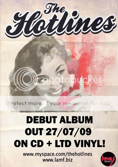 s for a similar band to The Pink Spiders.
It clearly shows the band's name at the top and release date at the bottom, it does not say much about the music. This one is for an album so for a single we could include the name of the song. This advert also includes the logo of the record label.
We will include the name of the band, the name of the song, the release date and website. We will use light/bright colours to relate to the song and the genre as it is up-beat and energetic. We will include a visual of the artist/band as the main focus which will take up most of the page.
Our target audience is teenagers so we will tailor our advert towards that age range. We will choose a modern style and colours, fonts etc to achieve this.
This one i
s for a similar band to The Pink Spiders.It clearly shows the band's name at the top and release date at the bottom, it does not say much about the music. This one is for an album so for a single we could include the name of the song. This advert also includes the logo of the record label.
We will include the name of the band, the name of the song, the release date and website. We will use light/bright colours to relate to the song and the genre as it is up-beat and energetic. We will include a visual of the artist/band as the main focus which will take up most of the page.
Our target audience is teenagers so we will tailor our advert towards that age range. We will choose a modern style and colours, fonts etc to achieve this.
Teacher Feedback on Pitch and Blog
The feedback I wrote down for the track you originally pitched for stated that more thought needed to go into the magazine ad and the digipak, that is still the case to some degree. It is essential that you sketch out your ideas for both products so that the examiner can see a development from your initial ideas.
Your ideas for the new track are stronger and I really like the editing techniques that you are proposing.
You all need to add in the Auteur and Goodwin presentations that you did in the first few weeks, they are on slideshare.net (search under S1-Goodwin and S1-Auteur).
Also some more individual analysis of videos that influence you would enhance your blog further.
Take a look at blog of the week for further inspiration.
Editing Technique
After looking at The Franz Ferdinand video - Can't Stop Feeling, we had a discussion about it and have decided to use similar techniques for the section in the song when it says 'Say you'll stay'. While this is said we would have...(insert)
Monday, 5 October 2009
Driving

We have decided that aswell as following on foot we will follow each other in cars. We will use mostly the perspective of just a single car to include the artist, however we will have certain shots from outside the car using different perspectives. We plan to use various different shots from inside and outside the car. Above is a shot from the matrix reloaded. An over the shoulder shot including the driver and front passenger, we will use similar shots except there will be only 1 person in the front. We also plan to use close ups and extreme close ups on different parts of the car. The image of a speedometer is taken from the opening scene of 'The Transporter', we plan to try and mimic this image except we will be filming the revolution counter as we don't plan to be driving over the speed limits due to road restrictions. Therefore this shot for us will work better with the rev counter building and dropping. The still of a wing mirror is taken from the film 'The Quantum Of Solace' we again will try to mimic this shot to show the car following, and to introduce the notion of looking. The still of the front of a BMW is taken from the film 'Ronin', we plan to use a similar shot to illustrate the front of the artists car.
Friday, 2 October 2009
Pink Spiders - Truth Or Dare (CHOSEN SONG)
We have chosen this song to be our final song. However we are merging the ideas from The XX - Heart skipped a beat with the Truth or Dare ideas to make it more narrative and more successful.
We are going to experiment with abstract visuals by making the artist jump to the beat of the song via the footage. We are going to include the narrative a boy chasing a girl after cheating.
Some ideas for shots:
Small car chase
performance of artist/band in enclosed location (GRUNGY)
dance routine
shots of interaction of main artist with the person he is chasing towards the end to show the happy ending.
(ESTABLISHING SHOT OF HOUSE/BUILDING)
Was it easy all along? (CLOSE UP OF ARTIST LOOKING OUT OF WINDOW PERFORMING SONG)
As the days went on and on (SHOT OF MOTORWAY FROM FLYOVER)
Going through the motions (WHEELS ON CAR)
Holding on to better years. (CLOSE UP OF HANDS ON STEERING WHEELS)
'Cause now all you'll hear from me (SHOT OF ARTIST DRIVING)
Is a familiar melody
From the wires to the speakers to your tired ears
So truth or dare (PERFORMANCE IN GRUNGY LOCATION UNDER LIGHT)
Let me hear it
Say you'll stay
Like you mean it
Or don't let go
'Til it feels like nothing's changed and nothing's wrong
With the things you tried to take
That I need to stay awake (SHOT IN COFFEE SHOP WITH A CUP OF COFFEE INFRONT)
That I need to trade the action for the old routine
So truth or dare
Let me hear it
Say you'll stay
Like you mean it
Or don't let go
'Til it feels like nothing's changed and nothing's wrong
'Cause day by day
She's a little
Closer still
To the middle
So kiss and kill me
A little more and more until you're gone
'Cause every single minute I'm drowning out there
And every single argument's endless (ARTIST AND FEMALE ARGUING)
And I know every indiscretion is breaking your heart
And every bad decision is defenseless
Truth or dare
Let me hear it
Say you'll stay
Like you mean it
Or don't let go
'Til it feels like nothing's changed and nothing's wrong
'Cause day by day
She's a little
Closer still
To the middle
So kiss and kill me
A little more and more until you're gone
Cutting To The Beat


We will try to cut to the beat during our song to give the video a faster pace. To do this we will mix different shots of the same location but with the artist in different places around the scene. Below is a video of a past media group that have also used this method in the first 11 seconds of the video. The artist jumps to different sitting positions on the bench and because this fits with the beat it works particuly well. Other parts of the video are not done quite so successfully, however this group was restricted to college grounds and we will not be.
New Music Video
After not obtaining our first choice of music video we have decided to go back to "Truth Or Dare" by "The Pink Spiders". This was one of our original top 3 choices and so we already have some ideas for this video. We also have some locations for shooting lined up. However we will not keep our exact original idea as we have had more time to concider our options. Unfortunately there is no music video of this song, but the A copy of the song is embedded below.

CD Cover
 Jamie Scott & the town- Park bench theories
The reason we have chosen this CD cover is bacause of the image. The image is the artist sat on a park bench, this relates to the idea we have for part of our music video, which involves both a famale and male sat on a park bench whilst lip syncing. We like this CD cover as it is simple and contains one image. The font is bold and simple containing the artist name and album name. The colours used within are plain, as the image is mostly green with the trees and the brown bench.